Designing for autonomy in a supervised system
I worked on an ML-assisted recommendation tool where users generate customer-specific recommendations while their supervisors generate parallel lists with broader parameters.
The challenge wasn't just making ML understandable, it was designing an interface that protected user expertise while satisfying organizational oversight needs.
Users have direct customer knowledge that supervisors don't. The system measures deviation between user and supervisor recommendations, creating tension between individual expertise and organizational conformity.
Challenges
The political challenge in the interface
Senior stakeholders wanted supervisor recommendations shown first, assuming users would take inspiration from them. But our research showed this would undermine the tool's value. Priming users with the supervisor's list would push them toward generic recommendations requiring more manual adjustment.
We designed a solution where both recommendations generate simultaneously from the same action, removing the implicit hierarchy. We visually de-emphasized the supervisor's list and introduced it later in the workflow, after users engaged with their own recommendations.
The compromise wasn't removing information, it was about timing and emphasis.
Continuous feedback
Through multiple conversations with stakeholders, we demonstrated that their goal (organizational alignment) and users' goal (customer-specific recommendations) could supplement each other if we sequenced information correctly.
The design work meant constant translation between research insights and stakeholder concerns. We prototyped solutions that gave ground to each side, making the case for designs prioritizing long-term user value over short-term organizational comfort.
Complexity
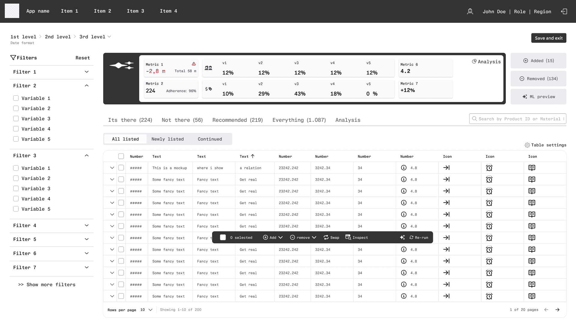
The model operates across multiple formats(child elements) simultaneously, adjusting recommendations up and down a hierarchy depending on settings—but users only see one format at a time. This created a fundamental disconnect between how the model worked and what users could observe.
We designed around this mismatch by surfacing the right level of information at each step. Users needed to understand why they were seeing certain recommendations without grasping the entire system's complexity.
The interface made the model's behavior legible without overwhelming users with everything happening behind the scenes.
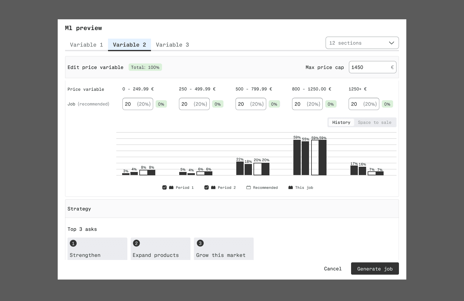
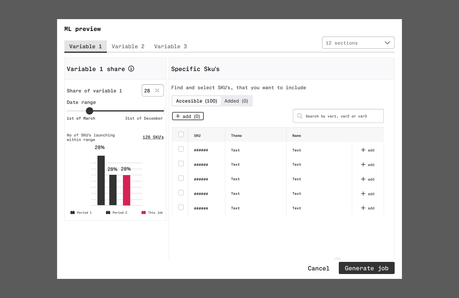
Guiding input without restricting freedom
We redesigned how users set parameters before generating recommendations. Early research showed users' settings often differed significantly from their supervisors', not wrong, but leading to more deviation and manual adjustment later.
The goal was getting users as far as possible with the initial recommendation, minimizing post-generation work. We focused on deliberate defaults, constraints, and explanations without removing the flexibility users needed to apply their expertise.